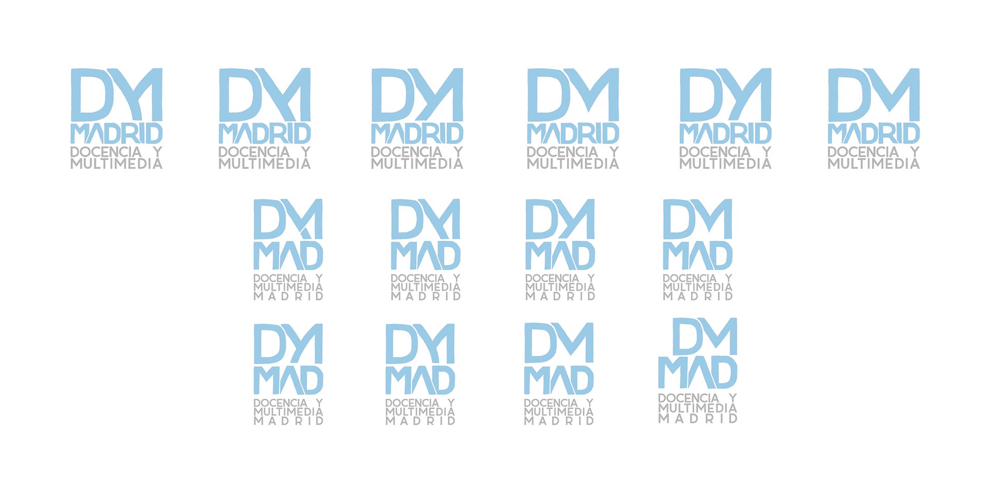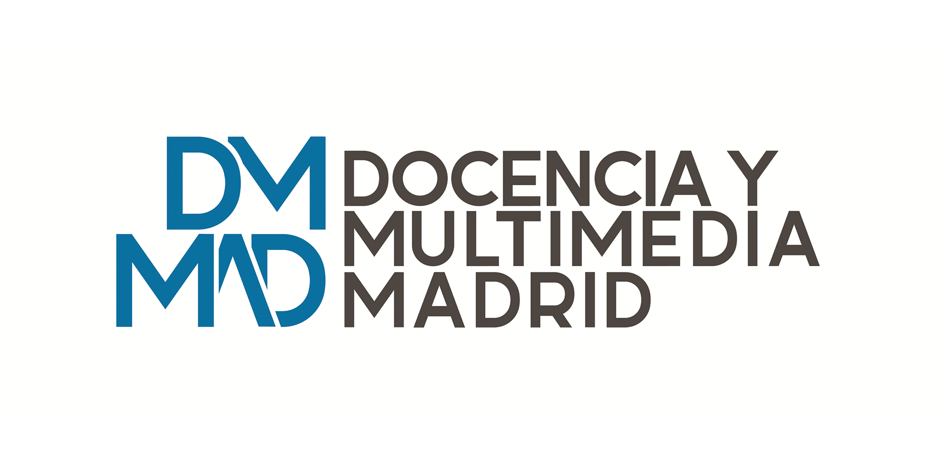
Due to the opening of its training center in Madrid, the academy "Docencia y Multimedia" required its original corporate identity to be readapted to the needs of its new location in the Spanish capital. To this end, the logo used by its branches in the Canary Islands served as the basis for creating the new visual identity of "Docencia y Multimedia Madrid." Thus, although its colours and simple geometric shapes were preserved in the new emblem, some modifications were made to distinguish it from the original design.
Therefore, just like in the original logo, not only were the Bauhaus-inspired forms in its typography and monogram retained—giving the design clarity and strength—but also the use of colours such as blue, which brings a sense of freshness and novelty, and dark gray, which adds solidity and excellence to the logotype. So, the only change made in this case was the reference to Madrid, both in its figurative and naming structure. Being this way, how the new brand took shape, resulting in a timeless design that is meant to endure over time.