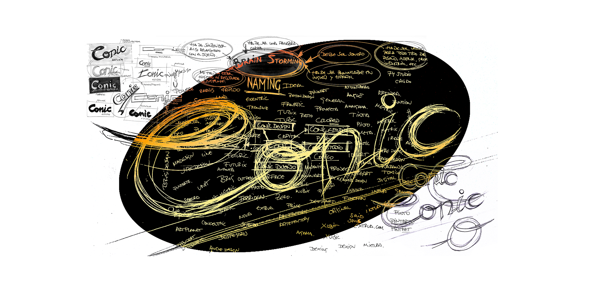
Conceived as a final course project, this corporate identity exercise, produced for the hypothetical design firm “Conic Estudio”, began with a brainstorming session through which numerous bold and unconventional proposals were generated for the company’s naming. Throughout this process, various formal and chromatic proposals were also put forward, which contributed to the subsequent development of its visual identity.
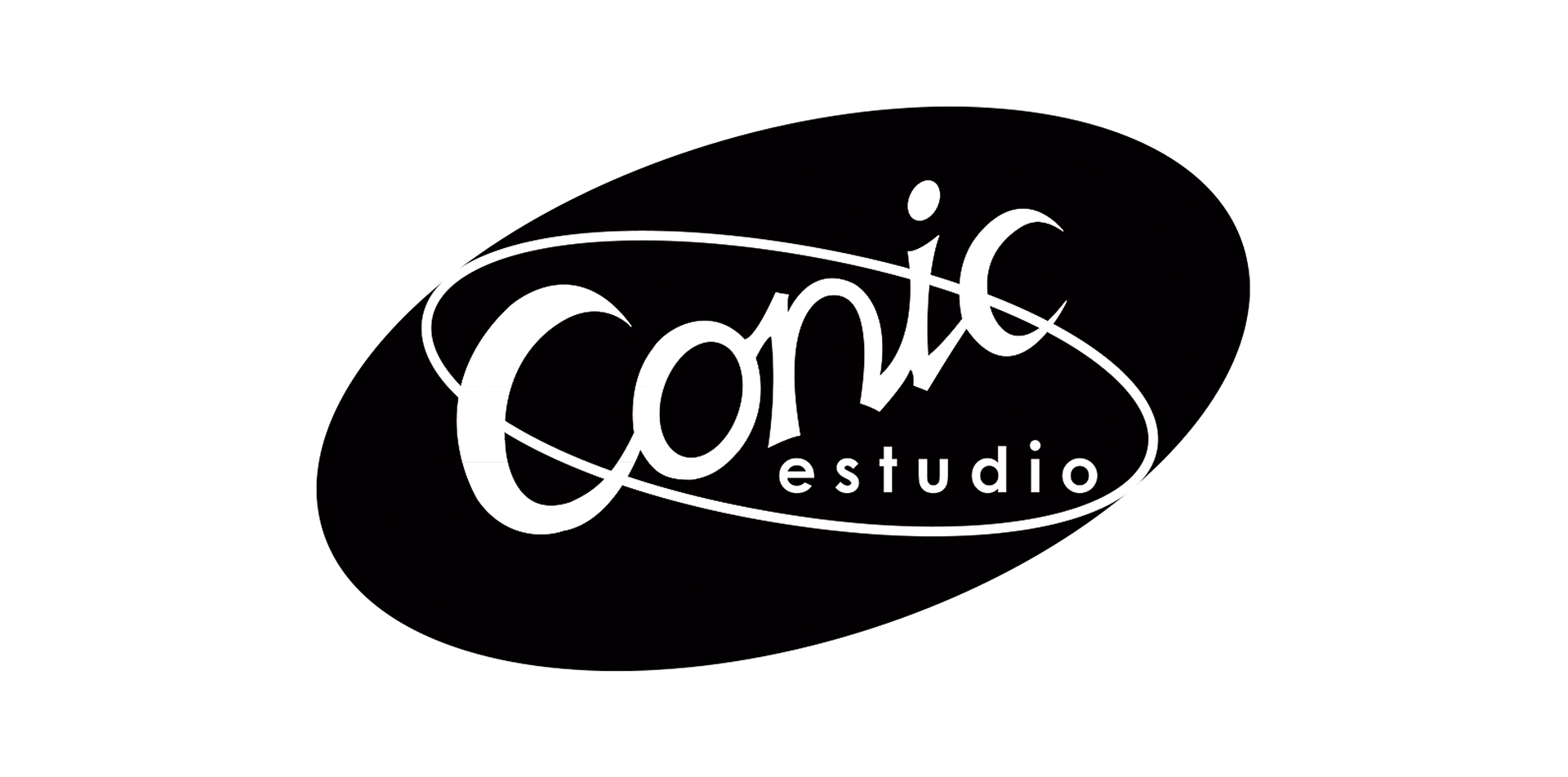
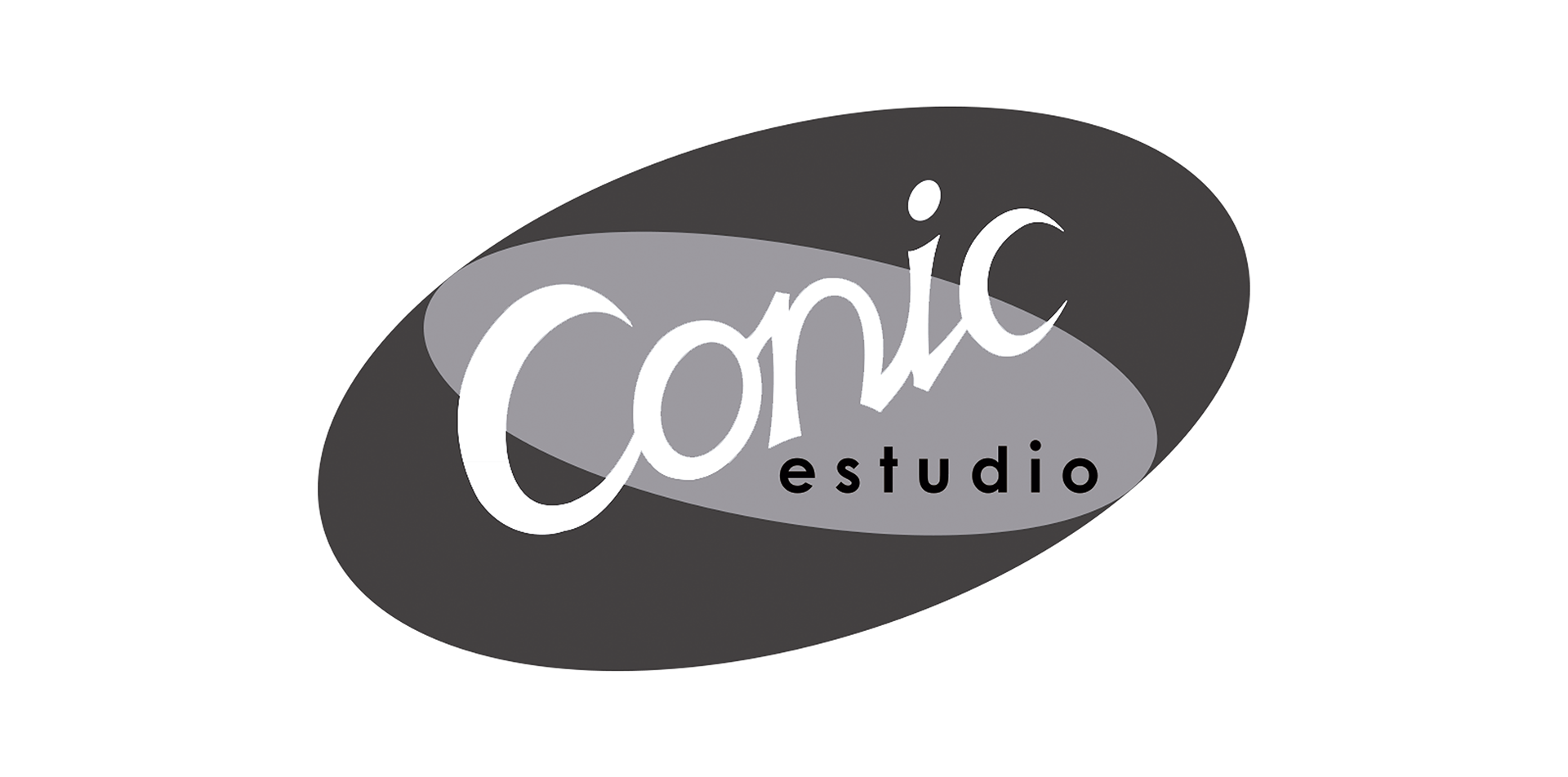
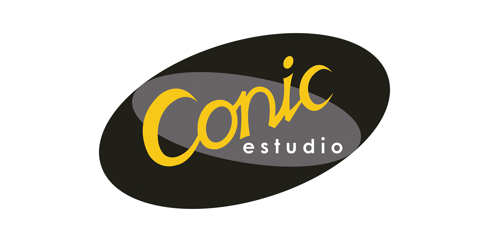
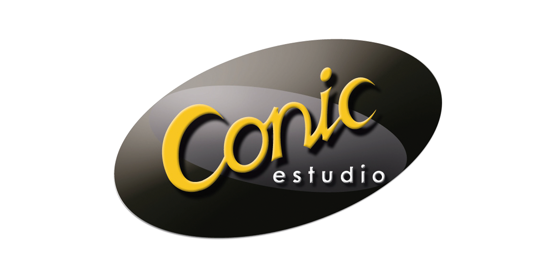
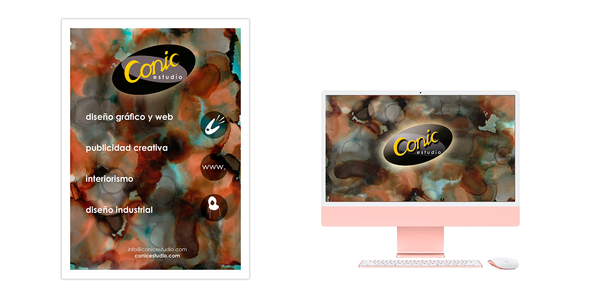
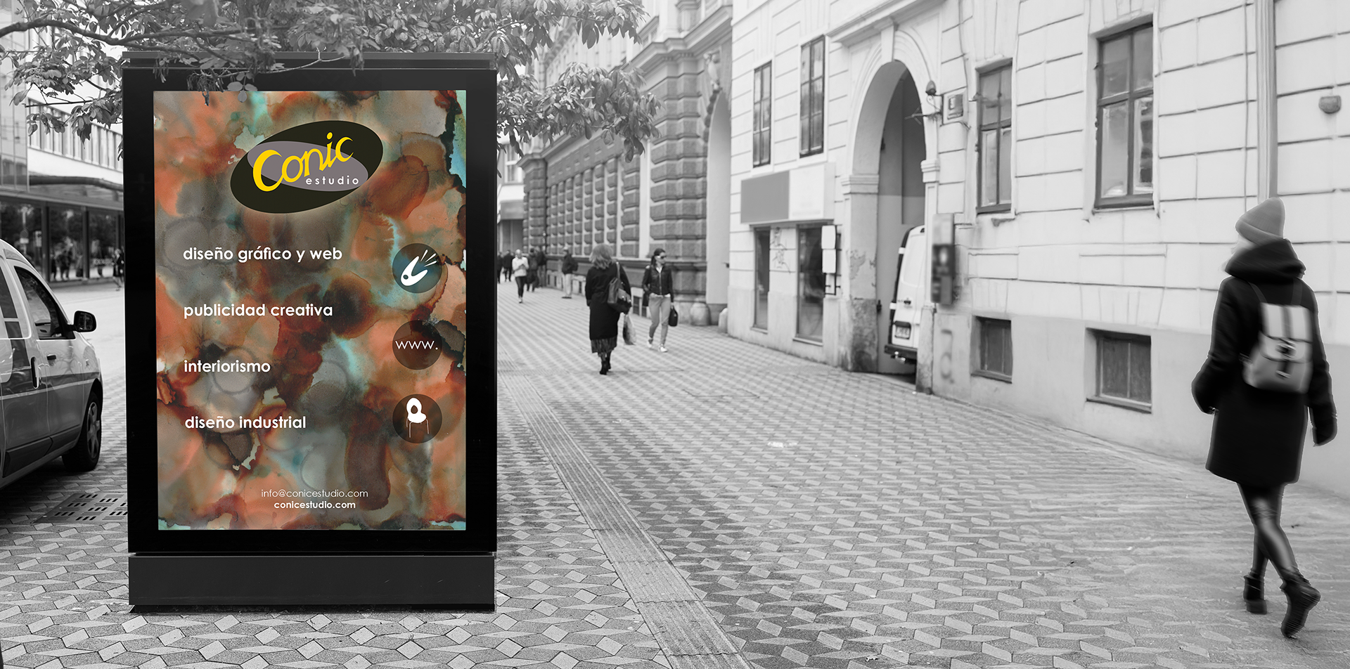
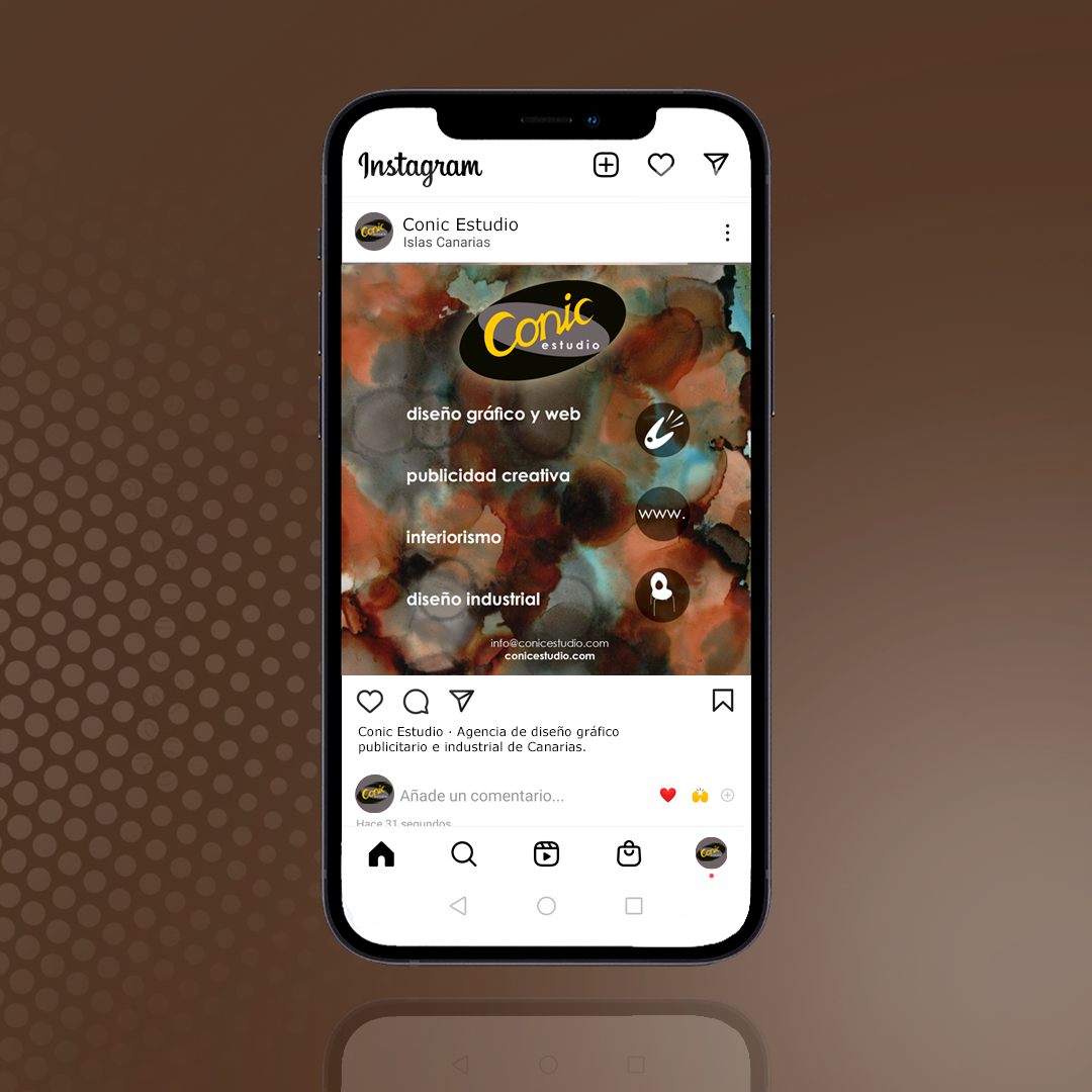
In this way, after establishing the definitive name “Conic Estudio” for this studio of graphic, industrial and interior designers, work proceeded to the logo design, which was rendered using a typeface with a distinctly American style from the 1950s, and where canary yellow and warm dark grey were used to create contrast between text and background.
Thus, the final design of this corporate emblem was achieved, in which the word “Conic” appears to float against a dark backdrop, where a subtle beam of light, like a theatrical spotlight, seems to be illuminating it.
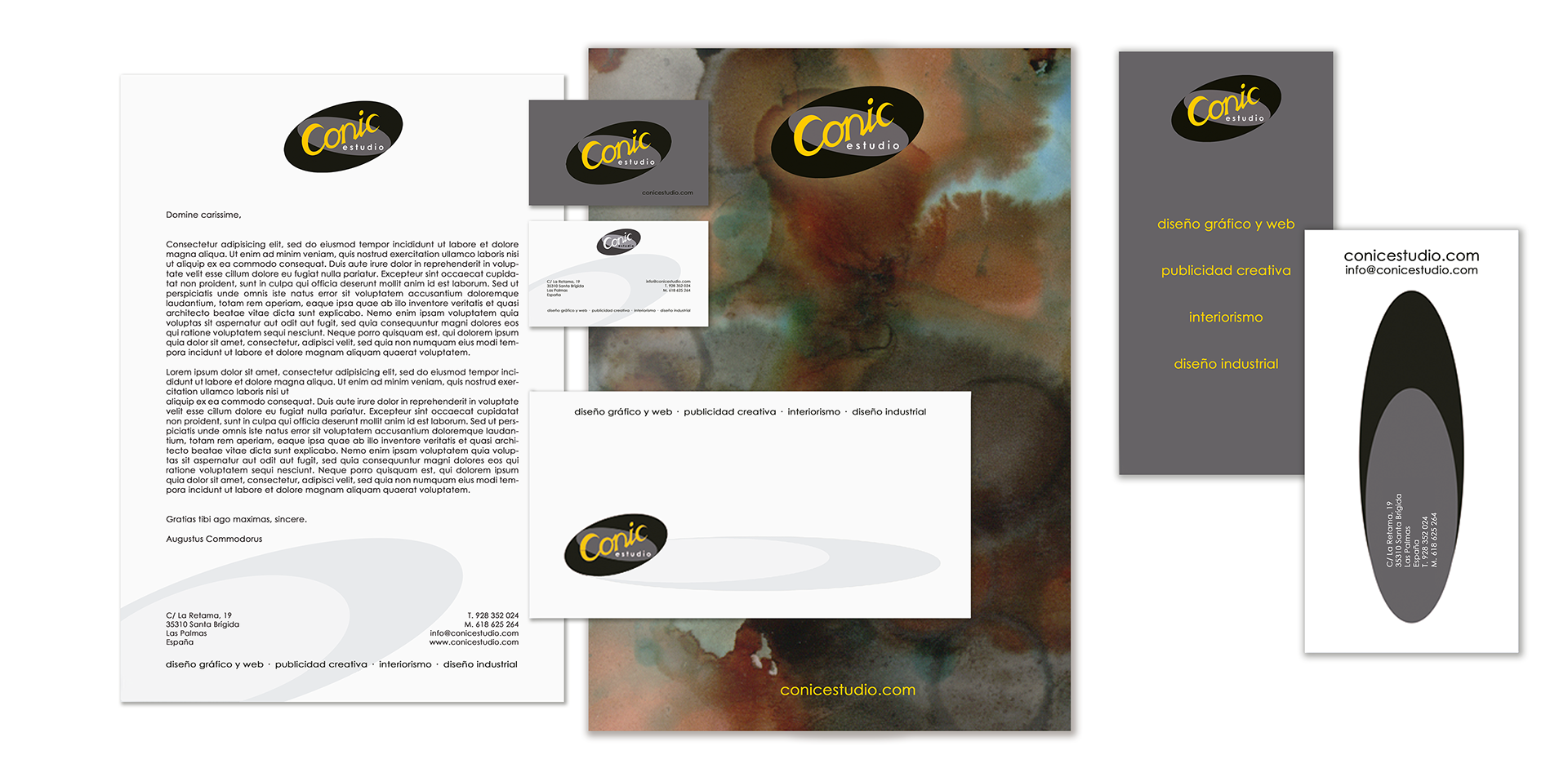
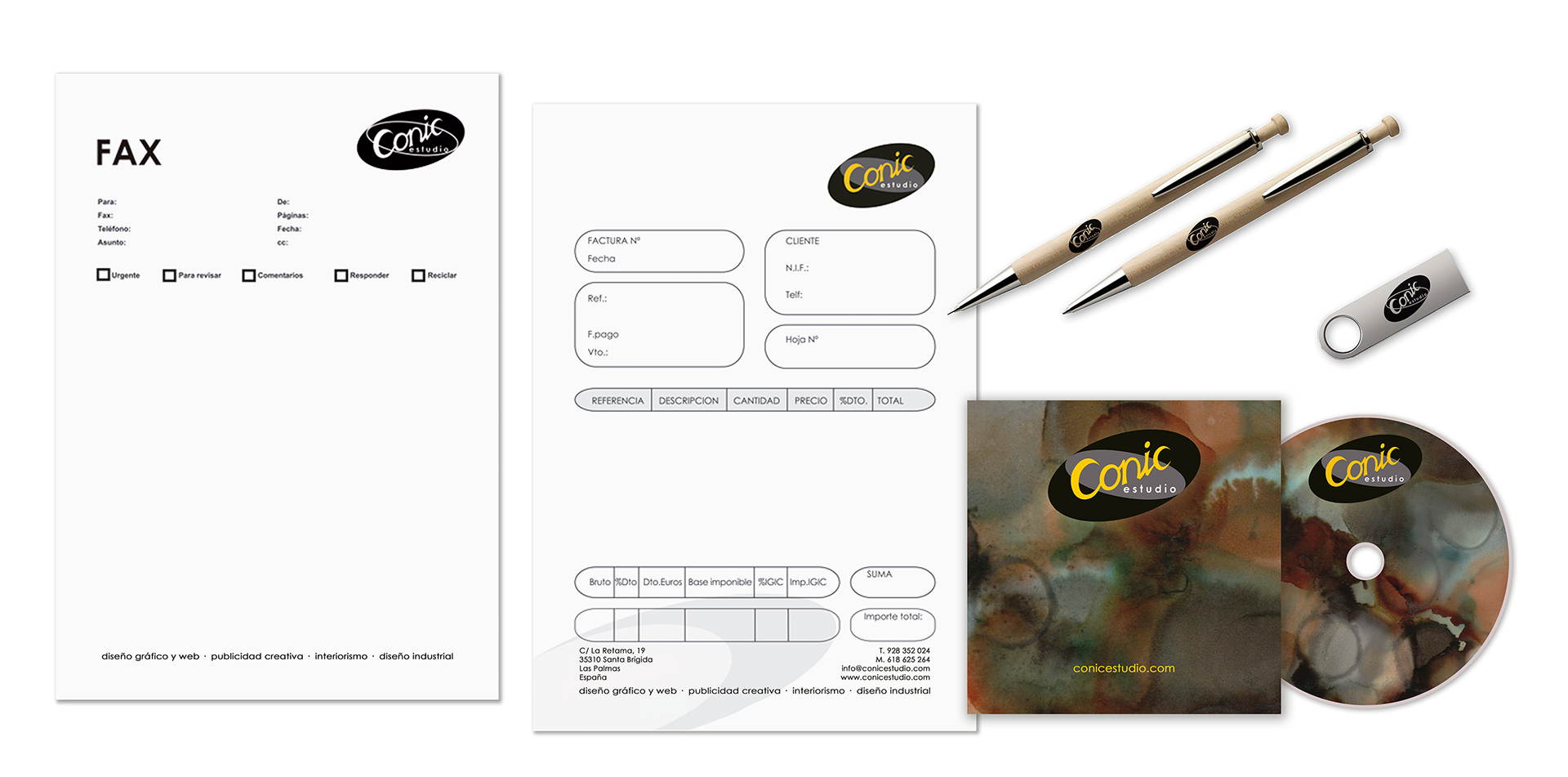
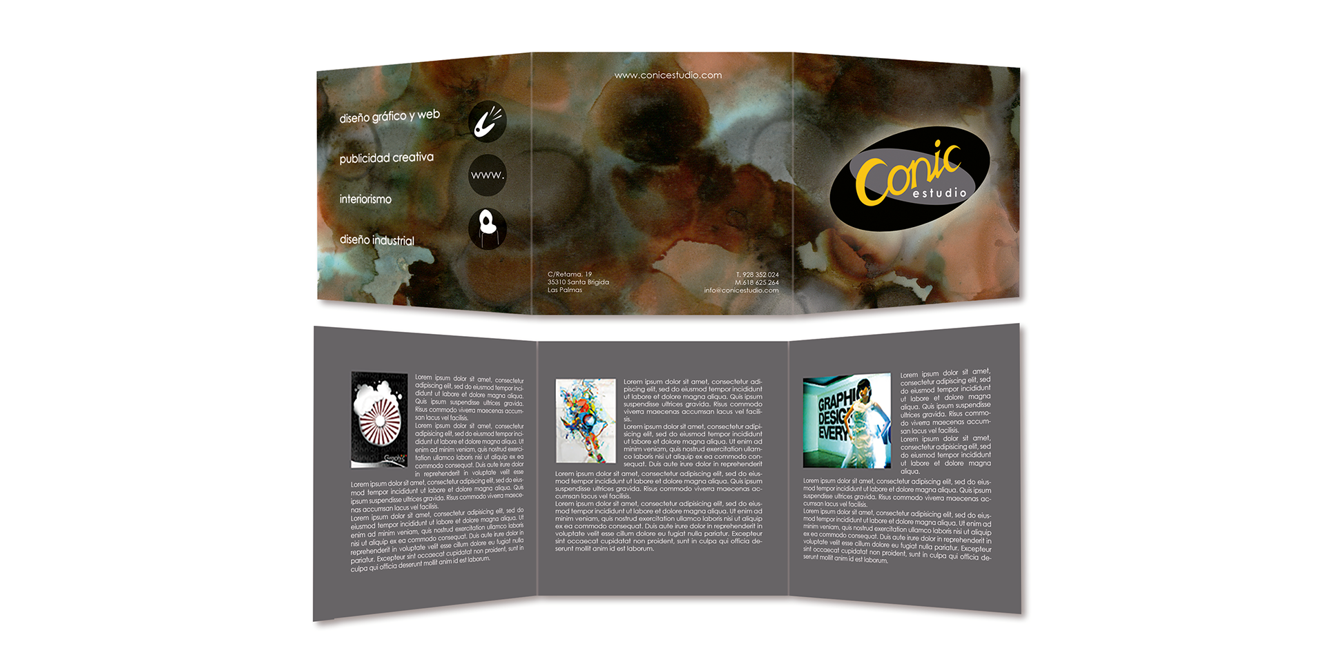
For the company’s stationery, the logo was used as a core element and displayed on an artistic background created from multicoloured ink splashes, conveying the creative character of the design studio and breaking the elliptical rigidity of the logo. The same approach was applied to the rest of the company’s promotional material, thereby maintaining aesthetic and visual consistency throughout the entire graphic project.