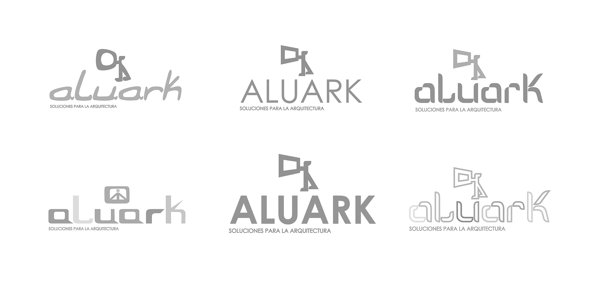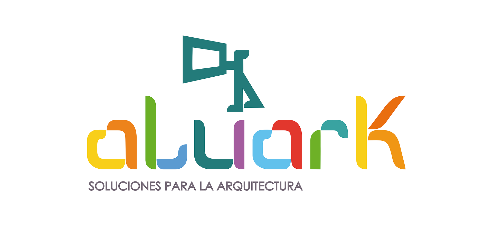
Aluark Canarias, a company dedicated to the construction of architectural enclosures in aluminium joinery, was the client both for the creation of the naming and the design of the logo that would represent it. In this way, when considering the company’s name, reference was made not only to the material used to manufacture the profiles for the doors and windows they build, but also to the field to which these products are directed.
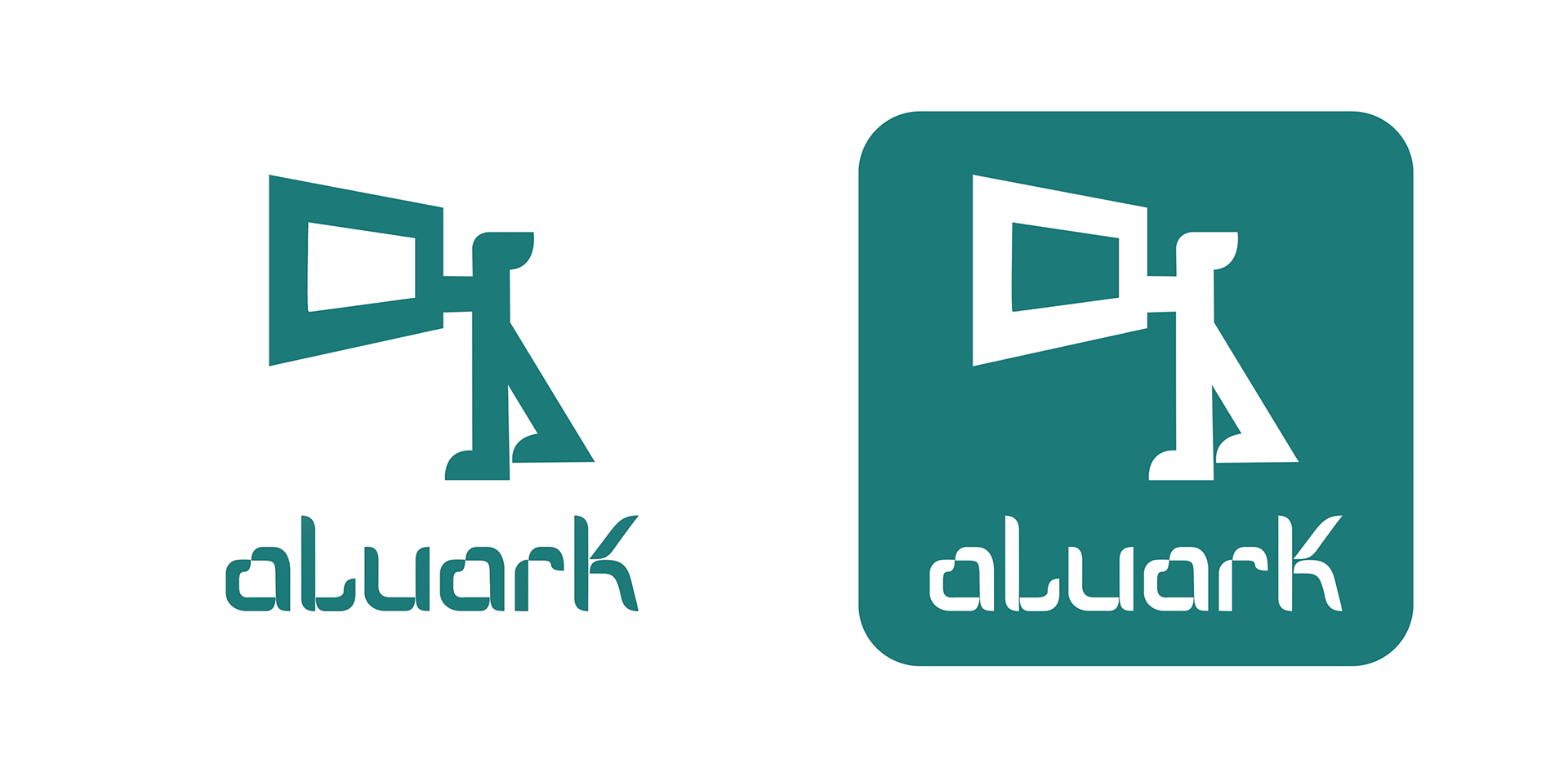
Additionally, when sketching the first drafts of the logo, the way in which the aluminium profiles are assembled was also considered, with the profiles being represented in an assortment of colours to form the typographic structure of the emblem. Finally, in creating the logogram accompanying the logo, attention was paid to how the company’s workers install these ingenious metal structures into the openings of buildings.
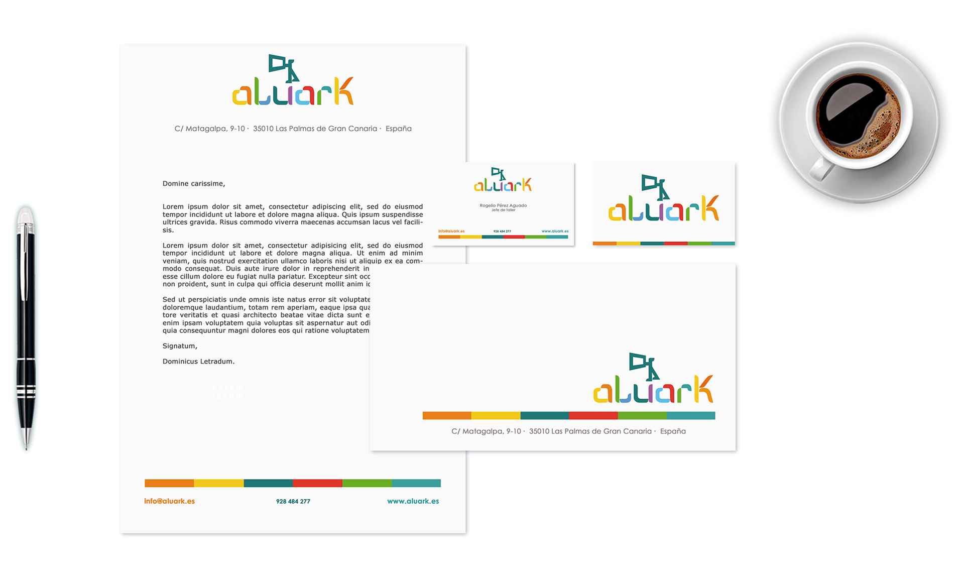
Furthermore, when designing the company’s stationery, although it features a vibrant colour palette, the same simplicity as the logo was maintained, with a touch of minimalism that imparts modernity and purity to the layout design, just as is seen in the vehicle lettering.