As we understand marketing today, separating graphic design from advertising is incredibly difficult to do and to comprehend. Every commercial advert, whether related to a product or a service, requires prior graphic analysis and the preparation of a representative technique or style, which will define the art of encouraging their consumption by the target audience.
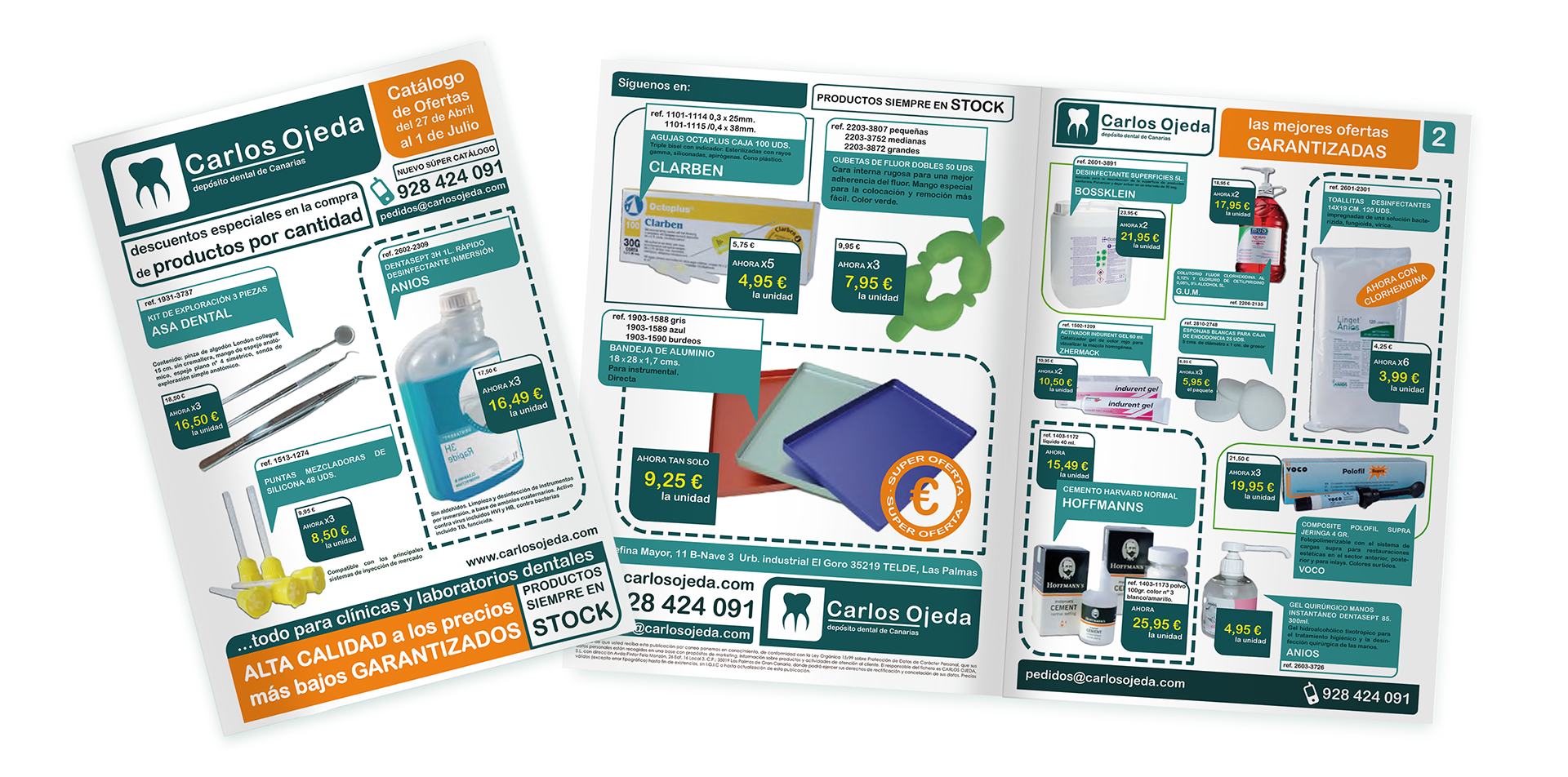
In this project, which promotes various dental health products, a clear, organised, and effective representation of each of the elements that make it up has been achieved. Furthermore, colours associated with health and sanitary care have been used, such as green in two different shades, and orange for those aspects and areas that should attract the customer’s attention the most.
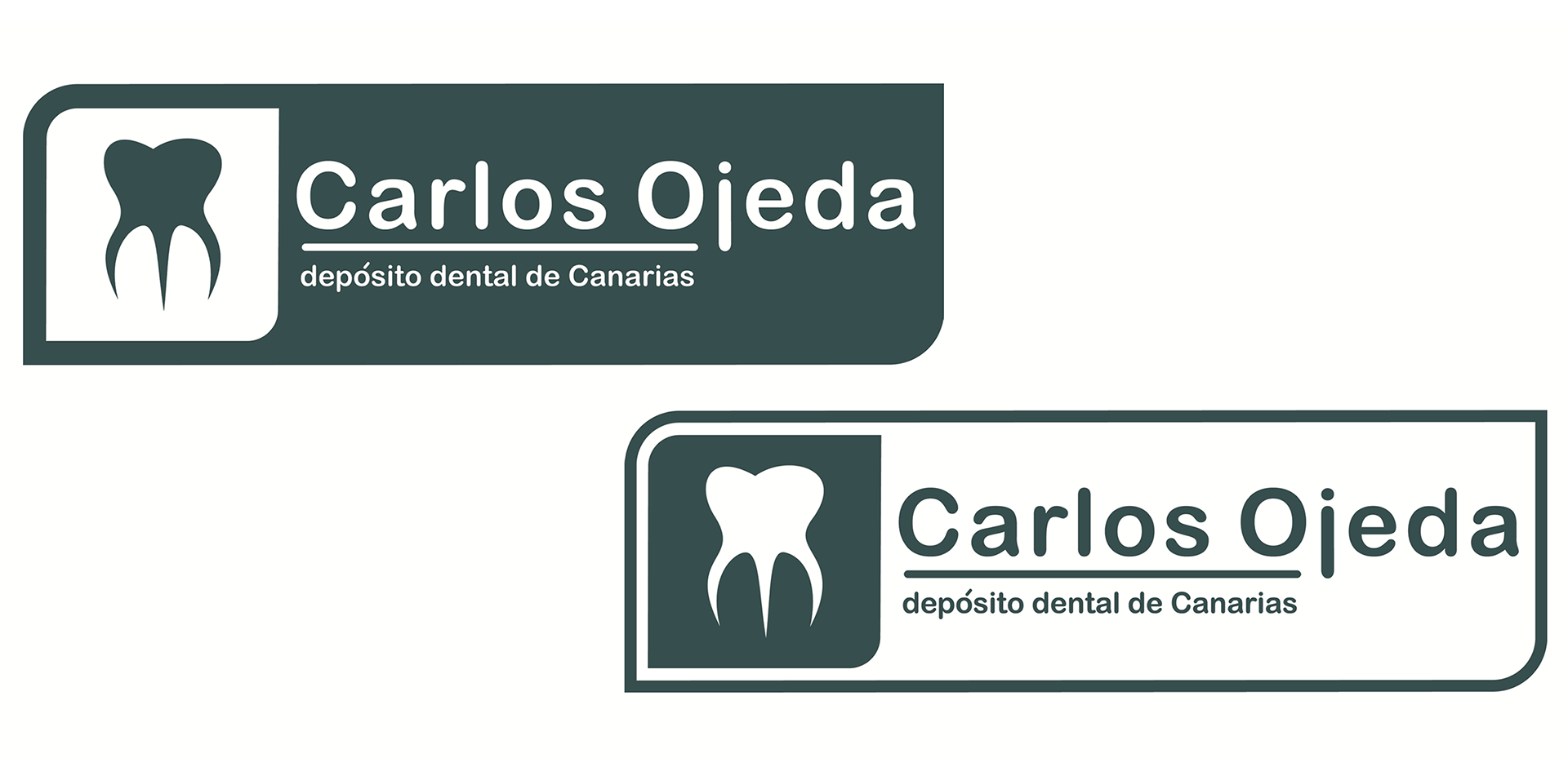
Regarding the graphic design used, the aim was to create a sense of connection with the customer by representing the company logo with a molar, which not only catches the eye but also leaves no doubt as to the type of products being advertised. All this is complemented by a typography featuring basic, rounded shapes that further soften the almost friendly appearance of these advertising brochures.