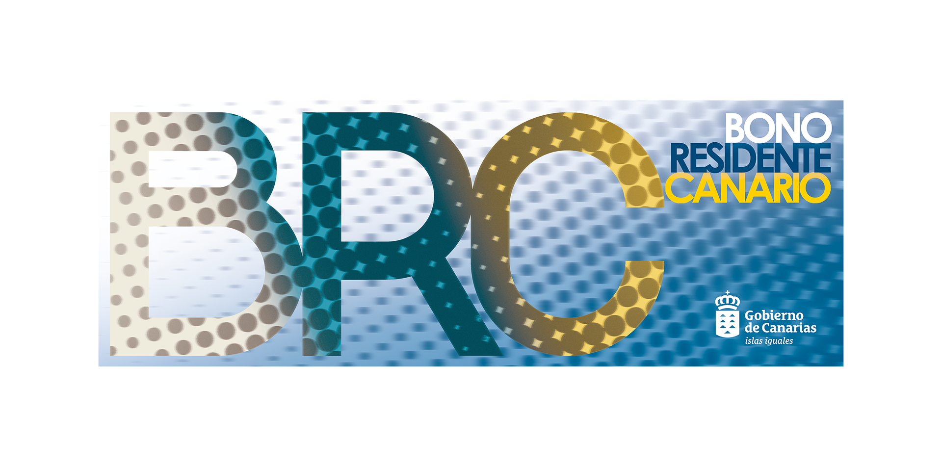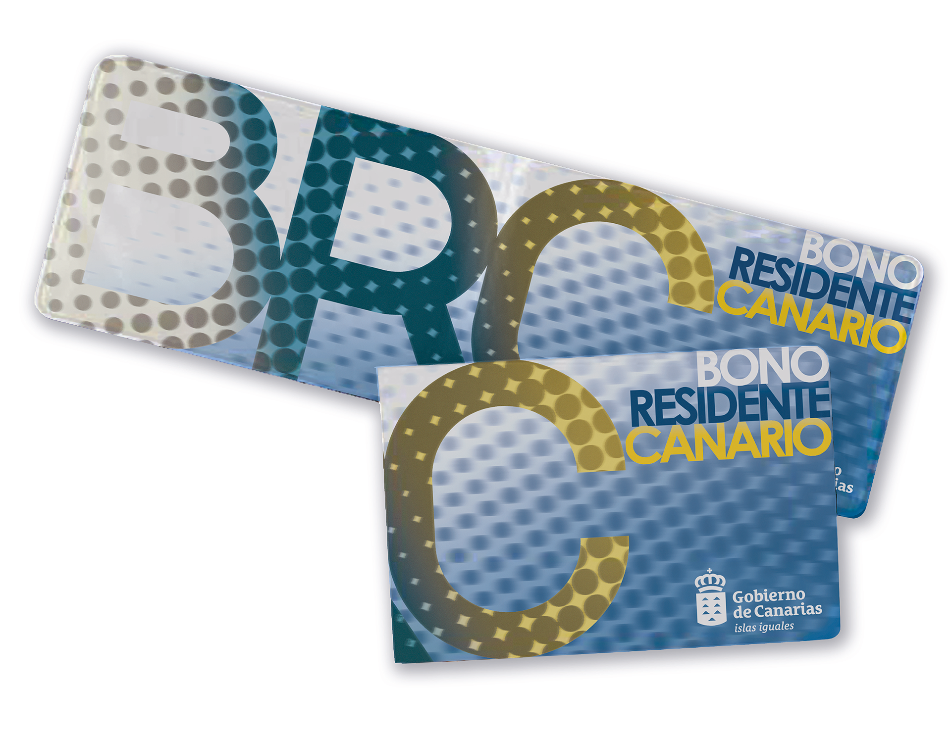
For my participation in the design competition for the voucher holder of the Canary Islands Resident Pass, I have taken as my main sources of inspiration the colours of the Canary Islands flag—an unquestionable symbol of identity and deep-rooted attachment to the islands—and the sensation of movement as an evocative state of the dynamism inherent in the various transport systems that make up the Canary Islands Sustainable Mobility agenda. In this way, I have created a simple yet expressive design in which pointillist motifs are used as descriptive elements of unity and connection between the different locations of the archipelago, which, through their movement, tend to attract each other and form a single cohesive element. These dynamic points are also identified, in an impactful and kaleidoscopic manner, with a state of balanced and sustainable mobility, in which everything flows in an orderly and natural way.
Likewise, the typeface used for the letters B, R and C in this representation has been created specifically for this design, while the Century Gothic Pro Bold typography has also been employed for the definition of the heading “Bono Residente Canario”. In this way, both typefaces, whose character is geometric and rational, lend consistency and robustness to the graphic composition, cohering to convey a subtle sense of unity.
Finally, for this composition I have also used the colours white, blue and yellow which, when diffused, form the tricolour flag and which, after applying a sandstone-like finish to the inner points of the letterforms and an acceleration effect to those of the outer background, produce a contrast not only in scale, but also in tone and colour.