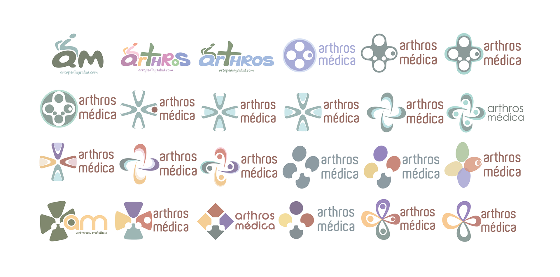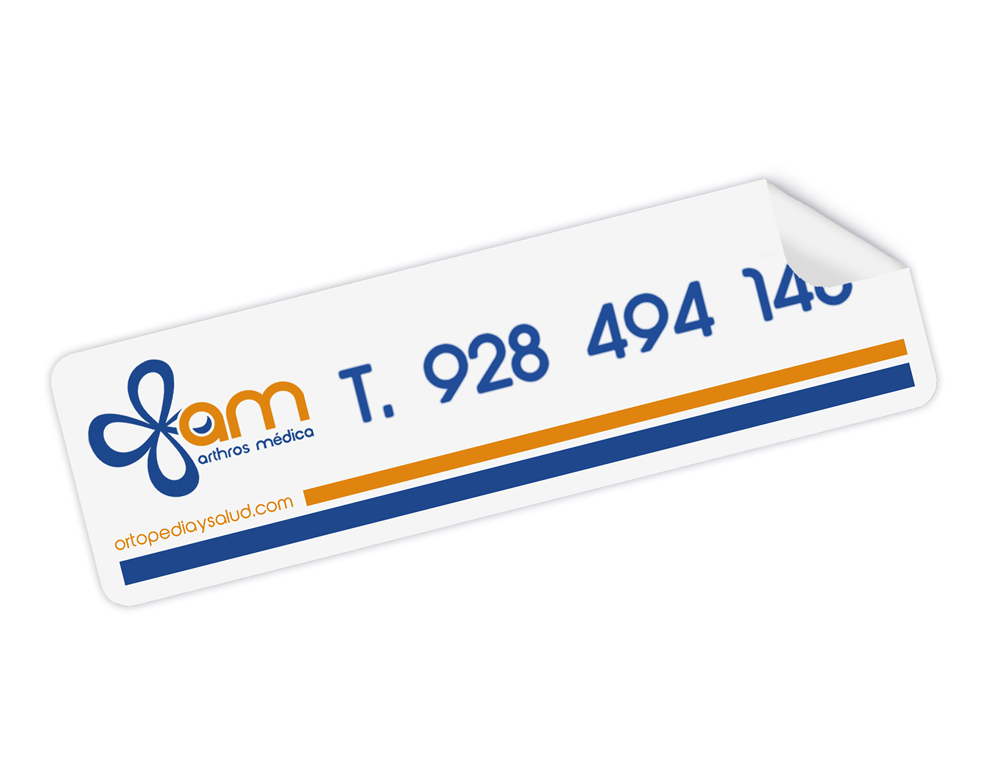
"Arthros Médica" was born from the merger of two companies, Renting Médica and Ortopedia Arthros, which came together to form a business dedicated to the supply of clinical, hospital, orthopaedic and rehabilitation products for the healthcare sector.
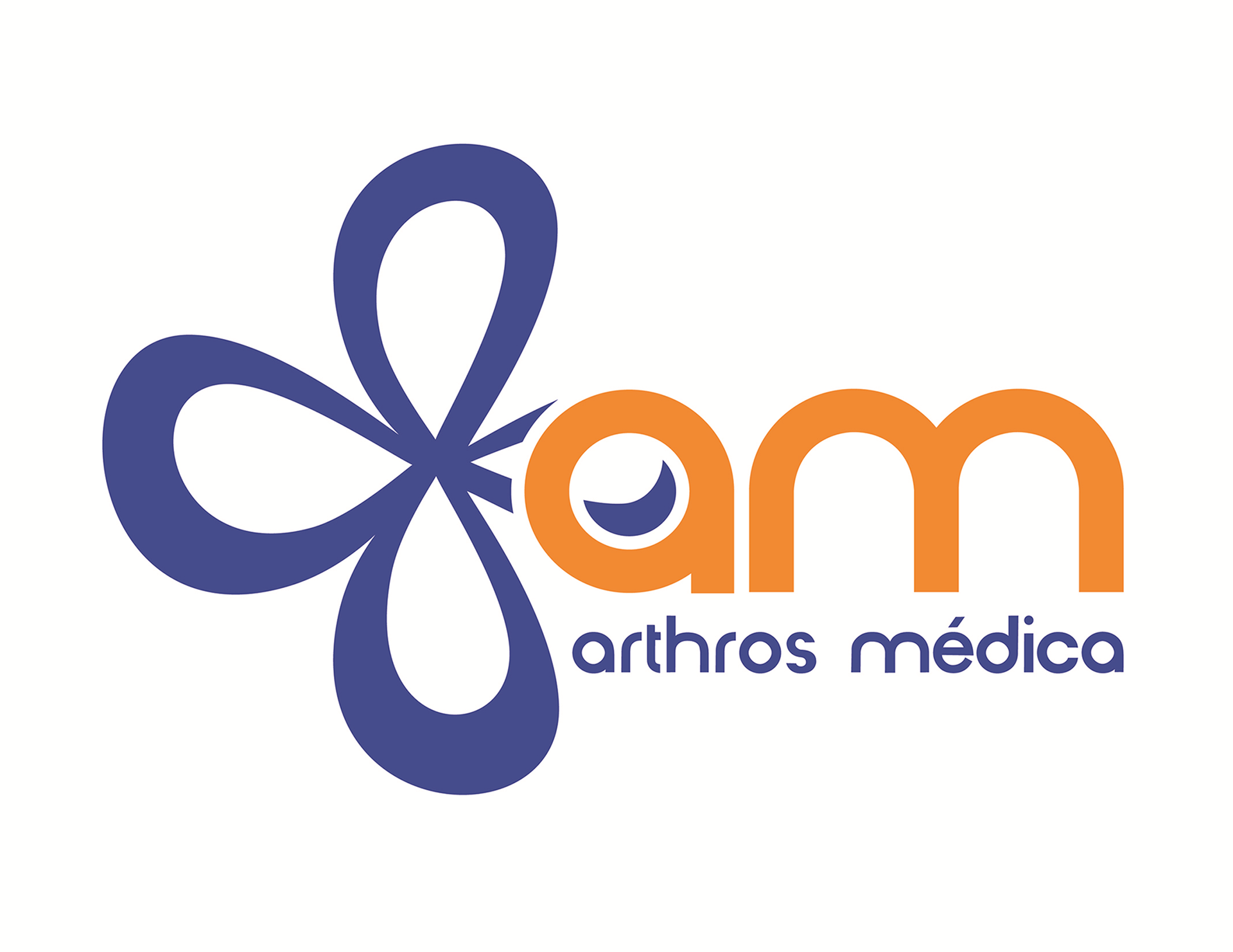
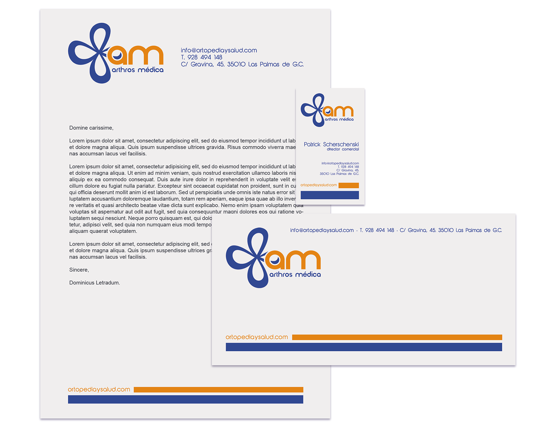
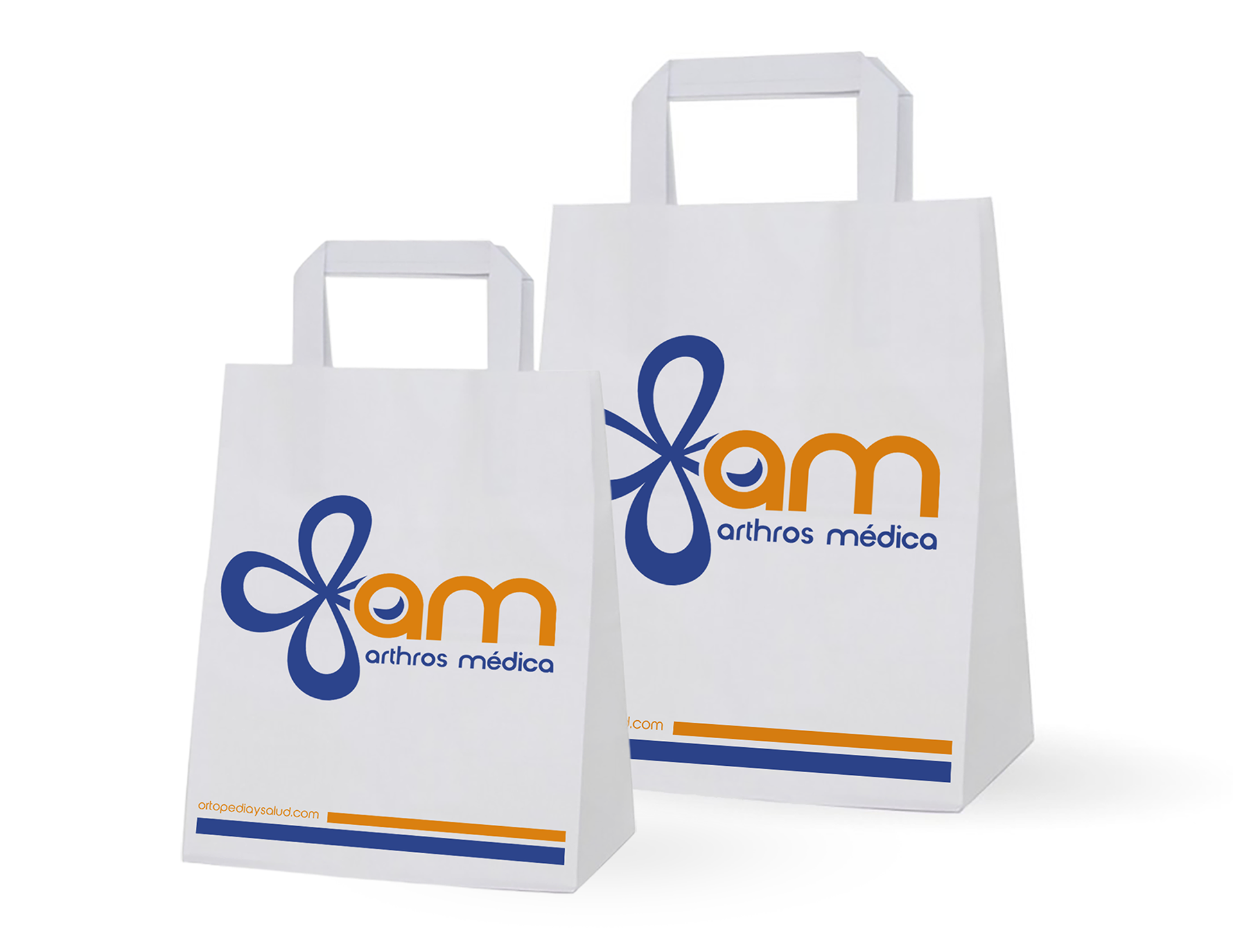
Its new logo, made up of a monogram in the shape of a four-band ribbon symbolising the union of both companies and the four healthcare branches to which the firm is devoted, also takes on the appearance of a medical cross that contrasts in a dynamic and light-hearted way with the initials of the company’s name, whose characters are rationalist and geometric.
Furthermore, to achieve perfect harmony in the logo, complementary colours such as blue and orange have been combined, lending brilliance and modernity to its form. For the heading “Arthros Médica”, the typeface Abeatbykai has been used which, once refined, blends naturally with the initials “am” in the design.
In conclusion, the logo is cheerful and visually appealing, with a certain expressive and abstract character that sets it apart from its competitors, thanks also to its refined clarity, legibility, and optimism.